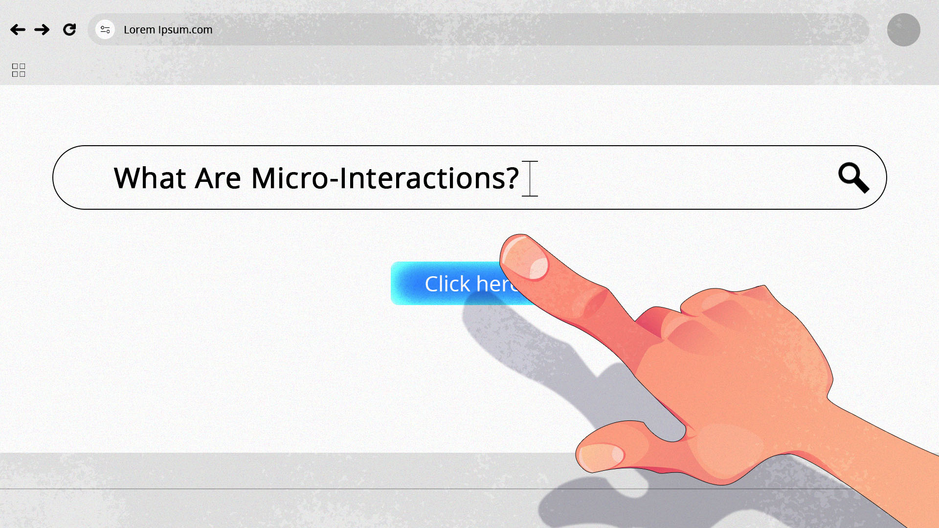
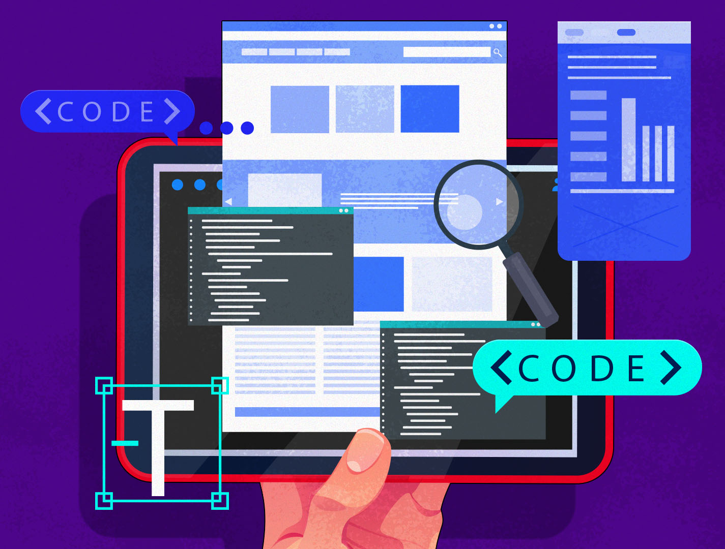
Ever noticed that the heart icon pops up when you like a post on Instagram? Or the orb that pulses when you are talking to Siri on your phone? How about those animated “...” when someone is typing on Facebook Messenger?
Those are what we call micro-interactions. They are those small, fun visual touches that make apps and your website feel more alive.
And if you think they are just some aesthetic extras, you couldn’t be more wrong! Micro-interactions play a big role in making the user experience (UX) more seamless, intuitive, and enjoyable. Sometimes, they are even the deciding factor on whether a user explores your site or scrolls away.
Want to learn more about them? Join us as we break down what micro-interactions are, how they enhance user experience, and how you can integrate them thoughtfully into your website, app, or even logo design.
What Are Micro-Interactions?
Micro-interactions are small visual animations or effects that occur in response to a user’s action.
Some common examples are:
- A heart bursting when you like a post.
- A text changing color when hovered over.
- A loading spinner that morphs into a checkmark when complete.
- A bell icon shaking when you get a notification.
- A shopping cart icon gently bouncing when you add an item.
- A progress bar that fills as you fill up a form.
- A toggle button changing color when it’s turned on or off.
And so on!
Think of them as the digital version of facial expressions. Just like how a nod, smile, or wink can add more context to your conversations, micro-interactions can also add meaning to each action a user does on your website.
Why Micro-Interactions Matter in Web Design
Micro-interactions may be a small visual effect (hence the word “micro”) but they have a huge impact on user experience.
Here’s why they are so powerful:
Help users navigate intuitively
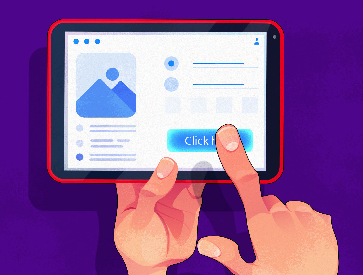
Micro-interactions serve as visual cues to guide your users.
For example, a button that changes color when you hover over it can indicate that it’s clickable. A search icon expanding can indicate that you can type on it. A form shaking or turning red can show that you made an error. Showing a progress bar can help users visualize how much more they need to do.
All of these can help a user move through your website with ease without needing lengthy explanations each time.
Provides the status of their actions

Micro-interactions help keep users in the loop of what’s happening when they use your site.
Uploaded a file? An animated spinner can help them understand that it’s loading. Waiting for a page to load? A percentage meter can convey to them how much longer they need to wait. Added an item to your cart? The shopping cart bouncing can confirm that it was added successfully.
Feedback is everything for your users. With micro-interactions, they don’t have to wonder if their input went through, if they clicked the right thing, or if the site is actually loading or not.
Reduces errors
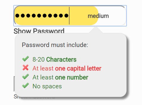
Micro-interactions can also help users avoid errors.
Let’s say one wants to set-up a password. A password strength meter can make them understand if their password is weak, fine, or strong. A password validation can also make it easier for users to know what else they need to do for their password to meet the site’s standards.
Some websites also have buttons that will only be clickable once you complete the necessary steps.
These visual indicators can help guide your users on the right actions to take when exploring your site. It can also remove frustration in your users and reassure them that everything is working as intended.
Makes interfaces feel more alive
Imagine just scrolling through a static website, where nothing moves and nothing happens when you click anywhere. It's boring, right?
And sure, a static website doesn’t mean that it’s not working properly. You still could get what you need without issues.
But will that really make you want to explore the site further? Will that make you come back to it more often? Probably not.
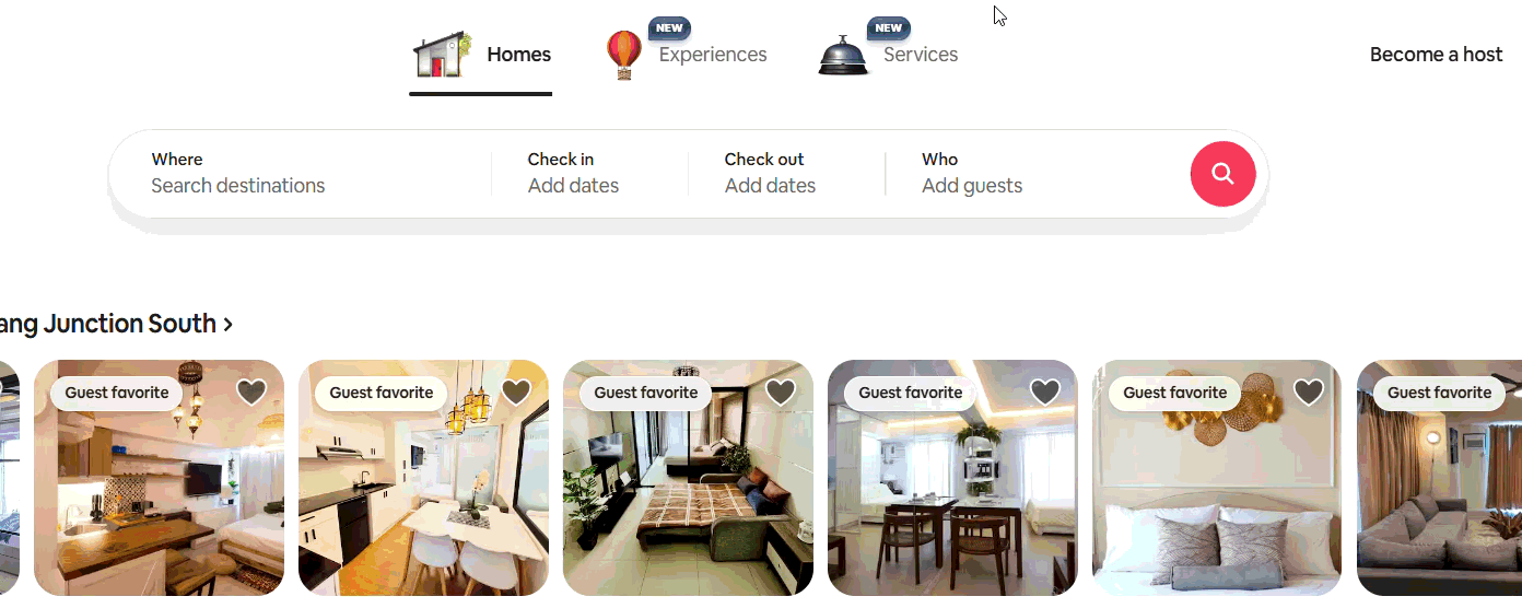
Micro-interactions can make your web design so much more dynamic, engaging, and fun. Confettis popping up when you complete a task, a soft “ding!” when you get a notification, images moving as you hover over them – all of those can make going through your site much more enjoyable and rewarding compared to regular, plain sites.
Just look at the Airbnb website example above. Nearly every UI has a subtle animation. Even though these are small and simple effects, they still make the site more lively to explore.
Reinforces brand identity
Micro-interactions are a great opportunity to showcase your brand personality.
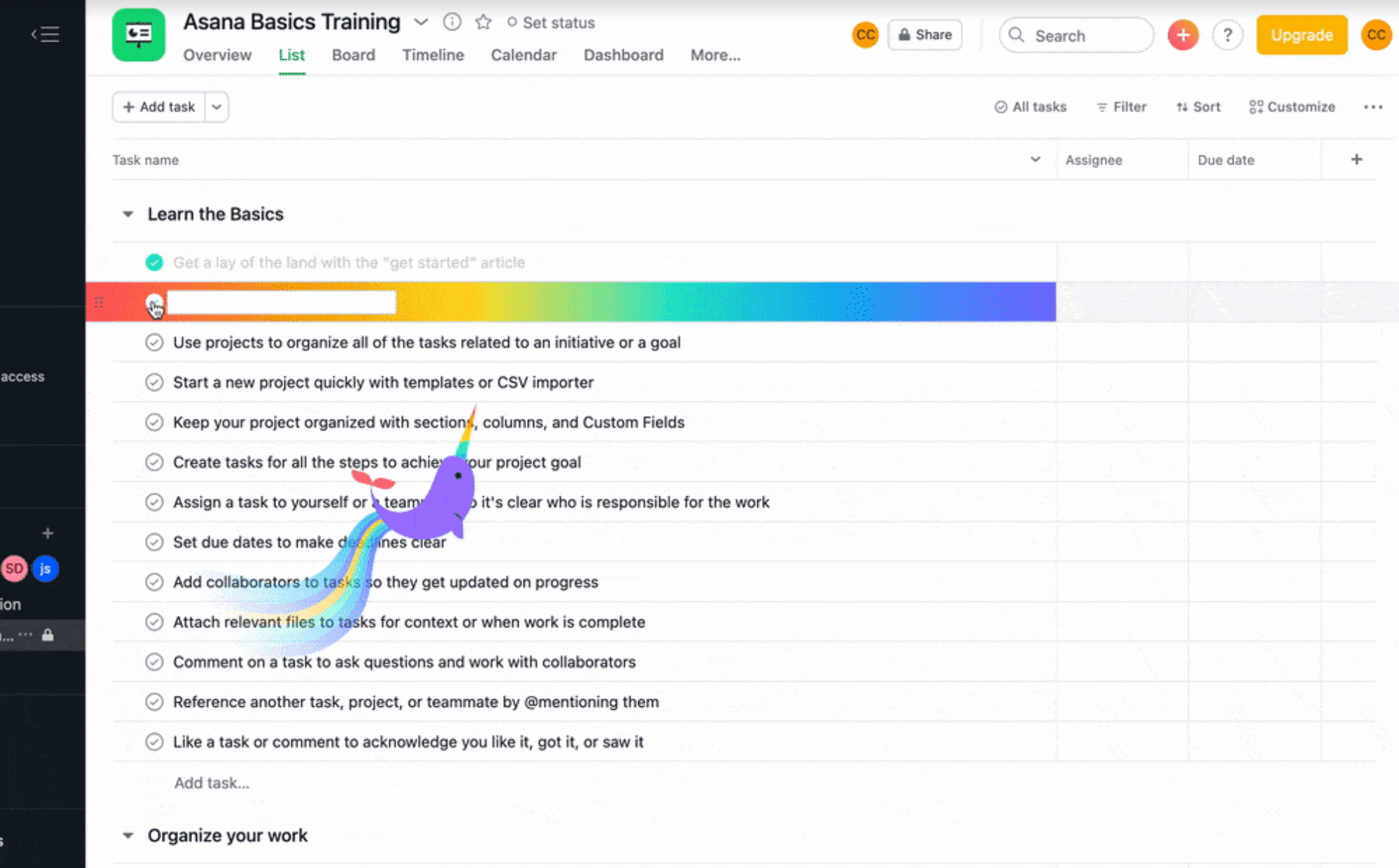
This can be seen by how your animations move, sound, or respond. For example, Asana’s micro-interactions are more on the playful side. A cute animal flies across the screen when you complete the task, while most of their hover color changes are rainbow gradients. This reinforces their brand values of making work feel more fun and easy.
Meanwhile, Apple’s micro-interactions are smoother, sleeker, and physics-based. This fits in with their modern high-tech branding.
Having your micro-interactions reflect your brand’s core traits can help make the website feel more like “you”. And when it is consistent with how your brand looks and acts across your other platforms, it’s easier for your users to recognize and remember your brand.
Best Practices To Design Effective Micro-Interactions
Here are the things to keep in mind when creating your micro-interactions:
Have a clear purpose
Your micro-interactions should have a clear reason why they are there.
Ask yourself these questions: Are they here to guide your users to the next step? To draw their eye to an important part of your site? To help explain a complicated task? To serve as positive reinforcement when successfully doing a step correctly? And so on.
Micro-interactions are not just for decoration. They are visual cues that communicate information and intent. Each one should have a clear purpose and narrative that fits into your user flow.
Keep it subtle
Less is always more. Your micro-interactions should be long enough to be noticed but short enough that they won’t interrupt or distract your users.
For example, a gentle color shift when you hover over a button is fine. But if you add burst effect, a drop shadow, plus enlarge it, plus underline it, then it’s too much!
Simple animations and minimal effects are also easier to understand. If you crowd the screen with multiple animations and instructions, it will all be overwhelming for users, which defeats the purpose of them to begin with.
Maintain consistency
Micro-interactions should be cohesive with the overall web design. Make sure to align it with the visuals, color palette, shapes, typography, and tone.
Let’s say you have a blue and white color palette for your website. If your hover button changes to a dark blue, it makes sense. But not if it turns orange or pink.
The same goes if you use rounded, flowy, and smooth visual style all throughout your site. Then your micro-interactions should stick to the theme for consistency. It will be confusing if your effects are suddenly all sharp and geometric, right?
Familiarity makes it predictable and easier for your users. If everything looked and worked the same, then they can finish their tasks so much faster and with less errors.
Align with your brand identity
Your micro-interactions should also reflect your brand identity.
Consider your brand’s emotional tone. Are you playful and upbeat? Then more whimsical animations can fit your site. Are you going for a luxurious and chic image? Then more subtle and minimalist effects are a better choice for your brand.
Details like these can help reinforce your brand’s personality. This way, every swipe, click, or tap can feel like “you”.
Design with accessibility in mind
Your micro-interactions should make the user experience great for everyone, including people with disabilities.
To design for accessibility, do the following:
- Have an On/Off option for the motions and animations
- Don’t rely solely on color, to make it accessible for people with visual impairments. For instance, instead of just making a form red to signify an error, add an “X” or “!” icon or add a text prompt.
- Have great contrast between background and foreground images and text to make them more legible.
- Make sure every important interaction like error messages and payment confirmation can be seen and read properly.
- Ensure that text is coded properly for screen readers.
Optimize for performance
Animations and special effects are fun, but not if it makes your website so laggy.
Website speed and performance should be your top priority. Try the following to optimize your micro-interactions:
- Use lightweight CSS as much as possible.
- Avoid large video files as this can severely slow down your site.
- Compress all image files to make them lighter.
- Minimize repaints or reflows for your animations.
- Avoid unnecessary scripts that could delay page loading.
- Implement lazy loading or conditional animations.
And of course, make sure to always test.
Check how your micro-interactions work across different devices and browsers. Does it load fast? Does it load correctly? Check how it works with data and Wi-Fi as well. Some animations may look great on a fast internet connection, but may look too choppy on a bad signal.
Comprehensive testing like this ensures your micro-interactions stay purposeful, user-friendly, and on-brand.
Top Micro-Interactions Examples in Web Design for Inspiration
Let’s now take a look at some websites that nailed their micro-interaction designs.
Roger Junior
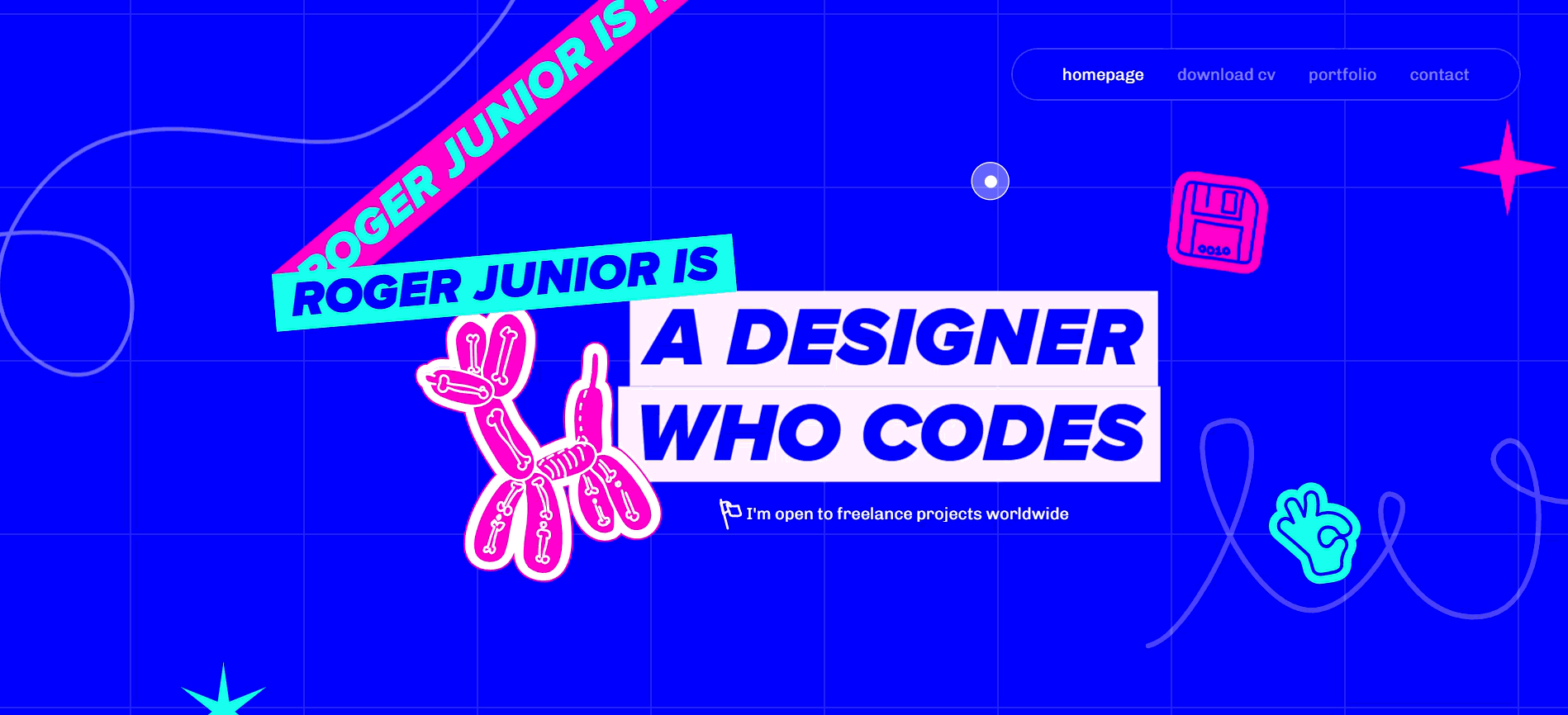
Want to see how creative and expressive micro-interactions can do for your web design? Take a look at Roger Junior’s portfolio.
They combined their interactive animations with bold typography, bright colors, and eye-catching graphics, making this a very fun and punchy web experience.
Another thing to note is the cursor in the site. As you can see, it’s a blue dot where a circle follows it wherever you click to make it form an eye. You’ll have loads of fun watching this!
Camille Mormal
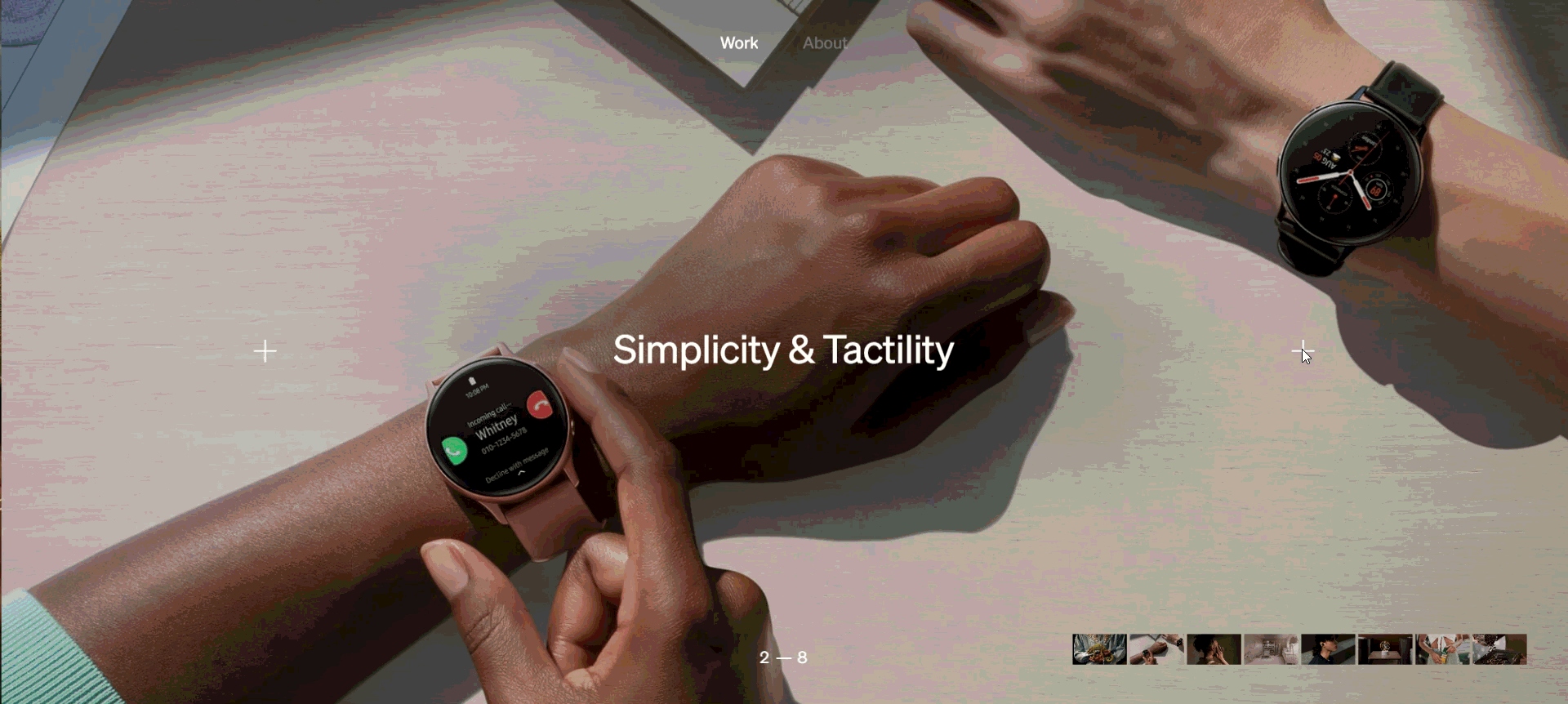
If you’re looking for something chic, minimalist, yet still visually impactful, look no further from Camille Mormal’s design portfolio.
The site features a horizontal scroll to view her works. If you look closely, you can even see the + button rotate as you click along with it. It’s a simple yet fun touch.
Her About Us page is also stellar. As you scroll down, the text gets revealed and highlighted. You can also see a box on the left side, which gives users an idea on which part they are on the page.
Knockouts Haircut & Grooming
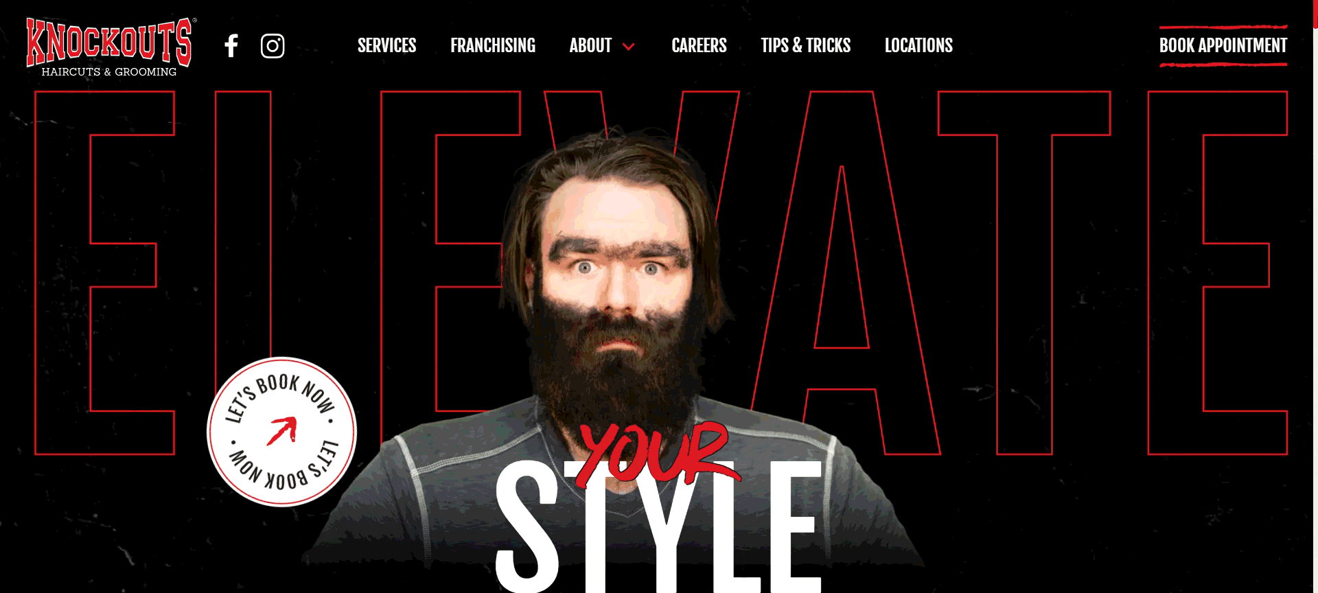
Want to amp up your scroll interactions? You’ll surely get inspired from this website.
You’ll first be greeted with an image of an unkempt man. As you scroll down, he will turn around and look ultra stylish, visualizing how cool you’ll be if you avail their services.
Scroll down further and you’ll see a fun animation of their photos of their customers in the salon. It will then expand out to create a beautiful and sleek collage.
You don’t even need to click anything. You just need to scroll and you’ll see all the magic happen!
TrumpDrive Energy
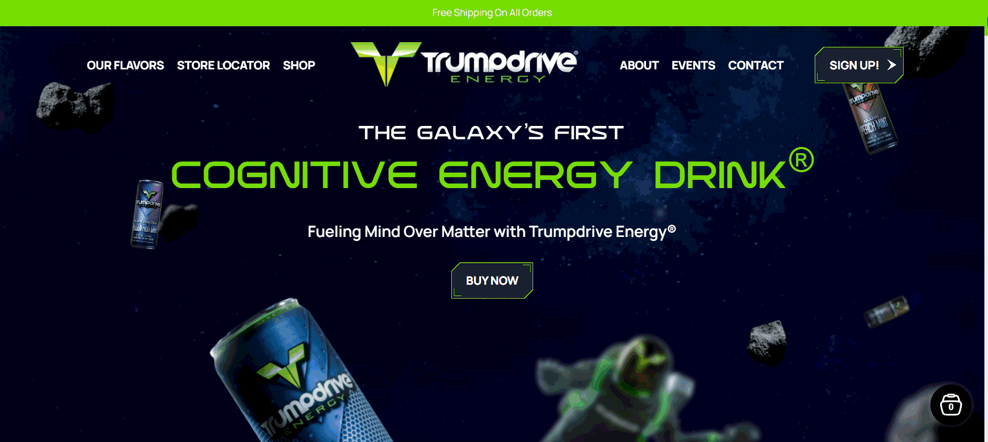
Looking to highlight your brand identity with your micro-interactions? TrumpDrive Energy did just that.
Their brand is all about redefining how energy drinks are with their innovative and out of this world formula.
Which is why their website is full out space imagery. Witty, right? We also really enjoyed how the astronaut was catching their energy drink as you scroll. Such a fun detail.
You can also see how they highlight their products by giving them focus as you click along.
Wolfpack Lager
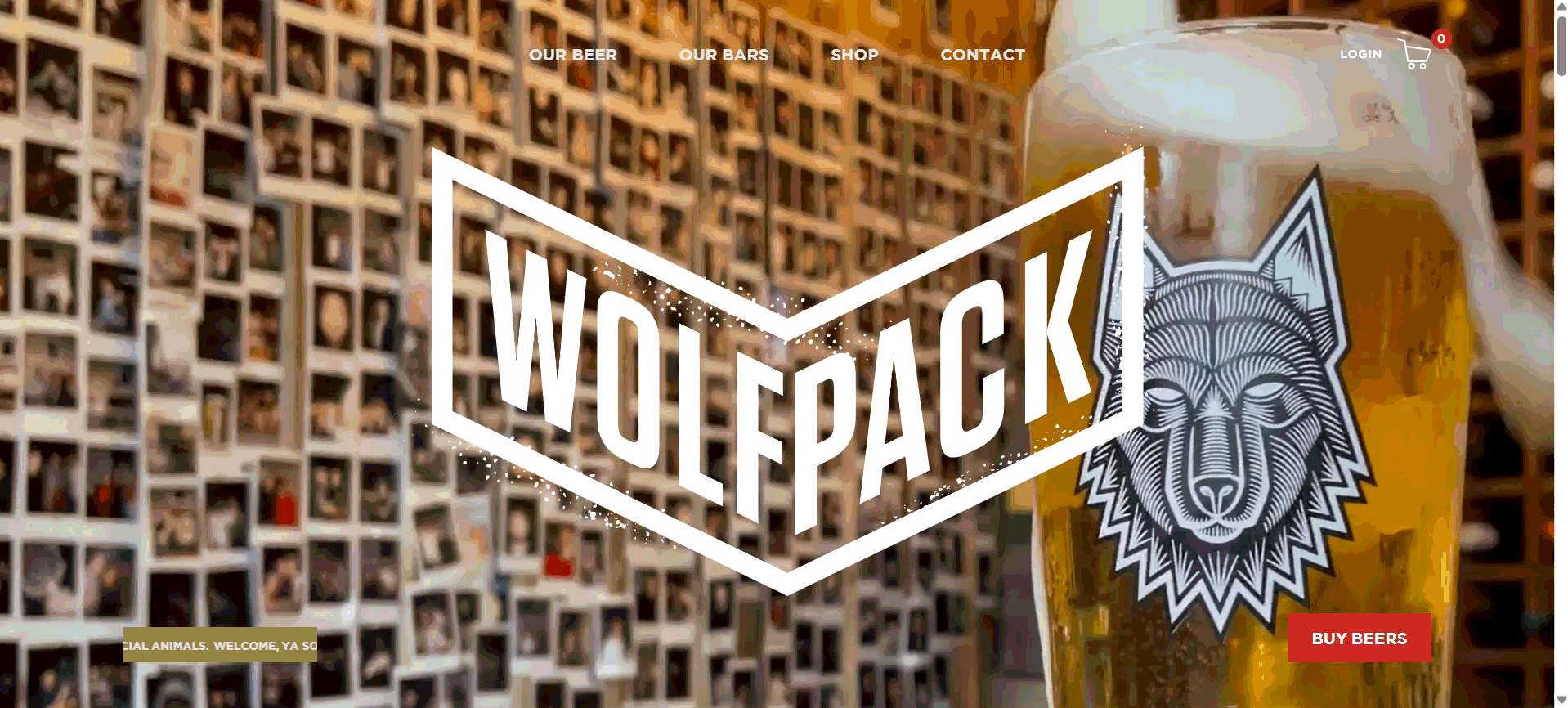
Wolfpack’s website is a great balance between sleek and bold visuals.
The stylish wolf logo and tattoo style designs gives this an urban appeal. The micro-interactions also add a layer of fun, with their hover effects, scroll animations, enlarged image marquees, and headers that float in and out.
Their copy also stays true to their sporty and casual brand voice, which fits perfectly with their branding.
How To Design and Add Micro-Interactions to Your Website
Designing effective micro-interactions requires more than just technical skills. It also needs strategy, creativity, and empathy. According to Joe Webster, a representative at Taylor Benefits Insurance, thoughtful micro-interactions can significantly improve how users trust and engage with a brand online. “When visitors fill out a quote form or navigate benefit options, smooth transitions and instant feedback — like progress bars or confirmation animations — help them feel secure and informed,” Webster explains. “It’s these subtle design details that make complex processes like benefits enrollment feel approachable and transparent.”
Let’s go through the process step by step:
Phase 1: Audit and identify opportunities
Start by mapping your user journey. This is the series of steps a user takes from the moment they land on your website to completing a task.
Then identify the touchpoints where your users take an action. These could be tapping buttons, clicking links, filling up a form, uploading files, receiving confirmations, and so on.
Ask yourself the following questions:
- Are users uncertain about what happens after an action?
- Do they need reassurance or confirmation?
- Are there moments where the experience feels static or emotionless?
These are your “invisible friction” AKA the small moments where users hesitate or pause. Let’s say you have a checkout button. If there is no loading spinner while the payment is processing or any confirmation animation after it’s done, then users will be left wondering if their payment actually went through.
You can find these friction points through heatmaps, website analytics, or session recordings. These can help you find where users pause, click repeatedly, or abandon an action, which is the best spot to put a micro-interaction.
Phase 2: Sketch and prototype
Once you’ve identified where micro-interactions can add value, you can move into the concept and prototyping stage.
Try to make your idea come into shape. Think of the following:
- What is the trigger? Is it a click, hover, scroll, or swipe?
- What kind of feedback will the user see? Is there a color change, motion, vibration, or sound?
- How long should the animation last?
- How will it loop or change over time?
Tools like Figma, Sketch, Protopie, and Adobe XD can help you make prototypes for your micro-interactions to make them easier to visualize.
Since you are also on your experimentation stage, create variations of your micro-interactions with different timing, animation styles, transitions, and movements first. This way, you can find which one works best.
Phase 3: Implementation and iteration
Once you’ve chosen from your prototypes, it’s time to make them come to life.
CSS is used to create styling and animations like hover, changing button states, or spinners. Javascript is for the dynamic interactions.
Let’s say you want to create a micro-interaction with a button. CSS is used to add a border or to add a bounce effect. But if you want to create an on/off toggle with the button, you’ll need Javascript.
You can also use animation libraries like Motion, LottieFiles, or GSAP where you can copy-paste finished codes instead of creating it from scratch.
Make sure to test the performance once you created and implemented the micro-interaction. Check if it loads quickly, runs smoothly, and doesn’t hinder usability. Several free website tools provide these insights, making it easier to identify where users hesitate or abandon important actions.
Phase 4: User testing and refinement
Nothing can be perfect from the first try.
Conduct usability tests or A/B experiments to see how users respond to your micro-interactions. You can ask questions like:
- Do they notice them?
- Are they helpful and timely?
- Did it clarify what was happening, or add confusion?
- Was the motion too slow, too fast, or too distracting?
- Do they like the design, or do they want to change color, shapes, or font?
You can also track data like click-through rate, dwell time, page bounces, task completion speed, etc. These can help you gain insights to further refine your color, speed, timing, or scale until your micro-interactions feel just right to your users.
Conclusion
Micro-interactions may be small but they are mighty.
They play a huge role in making your user experience as smooth, seamless, and intuitive as they can be. Think of them as a guide. Instead of giving out long instructions to your users where to click, you can just add a pulsing or bouncing button to draw your user's eye to them. It makes it easier for your users, plus adds delight to their exploration of your site.
Of course, a great web design doesn’t just rely on micro-interactions. Your overall design and branding matters too. Check out our tools like website builder, logo maker, and video maker to make your site look as visually stunning as possible.
Happy designing!
Read more about web design here:
FAQs on Micro-Interactions in Web Design
What are microinteractions?
Micro-interactions are small animations or visual effects that happen in response to a user’s action in a website. They provide feedback, guide users, or add delight to digital interactions.
How do micro-interactions improve user experience?
Micro-interactions can improve the user experience by making the site feel more intuitive. This is because users get clear feedback from each of their actions (ex. A thumbs up animation after a payment goes through or an error message after typing a password wrong). They also make interfaces feel more responsive, engaging, and fun compared to static websites.
Are micro-interactions necessary for all websites?
No, it is not a requirement. However, most websites can benefit from them as they improve user experience and make their sites more enjoyable to use for their customers.
Faviola Publico is an SEO Content Writer specializing in branding and digital marketing strategies. Outside of work, she enjoys reading slice-of-life novels and watching any mystery thriller-themed series.
Original Images by Khim John Blazo
Written by DesignCrowd on Tuesday, November 4, 2025
DesignCrowd is an online marketplace providing logo, website, print and graphic design services by providing access to freelance graphic designers and design studios around the world.
