Have you ever thought about how much power a single color holds? The right color can make people trust your brand, feel excited, or even crave your product. That’s the magic of color psychology—using colors to influence emotions and decisions. This concept is especially important in logo design, where the right color can define your brand identity and resonate with your audience.
But here’s the tricky part: colors mean different things in different cultures. What works in one country might send the wrong message in another.
So, how do you create designs that work everywhere? By understanding how color psychology and culture go hand in hand. Let’s dive into how to use the meaning of colors to make your designs global.
The Basics of Color Psychology
Have you ever noticed how colors can affect your feelings? Blue might make you calm, while red can spark energy and excitement.
Learn more about color psychology here:
What is color psychology?
Color psychology is the study of how colors influence human emotions, behavior, and decision-making. Different colors can trigger specific feelings or actions, which are used strategically in design and branding.
For instance, warm tones like red and yellow evoke energy and excitement, while more fabulous shades like blue and green create a sense of calm and trust.
Emotional Impact of Colors
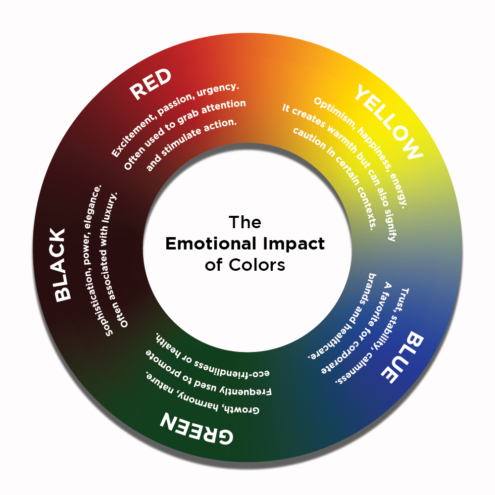
- Red: Excitement, passion, urgency. Often used to grab attention and stimulate action.
- Yellow: Optimism, happiness, energy. It creates warmth but can also signify caution in certain contexts.
- Blue: Trust, stability, calmness. A favorite for corporate brands and healthcare.
- Green: Growth, harmony, nature. Frequently used to promote eco-friendliness or health.
- Black: Sophistication, power, elegance. Often associated with luxury.
Examples
Color psychology is everywhere, shaping how we experience the world and interact with brands. Let’s explore some common examples of how colors are used strategically:
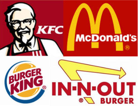
- Fast food chains: Red and yellow are staples in fast-food branding, with chains like McDonald’s and KFC using them to stimulate appetite and create energy. Red triggers hunger and urgency, while yellow adds a sense of friendliness and warmth, encouraging quick dining experiences.
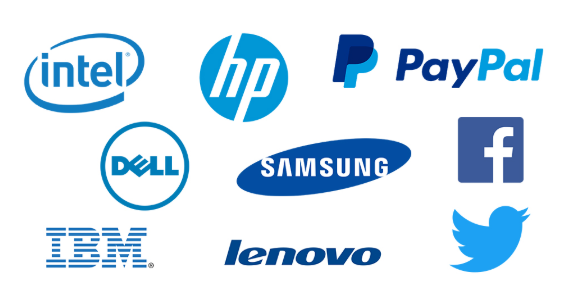
- Tech companies: Many tech brands, like Facebook, Twitter, and LinkedIn, use blue in their logos and designs. Blue conveys trust, stability, and professionalism—key for platforms where people connect and share personal information.
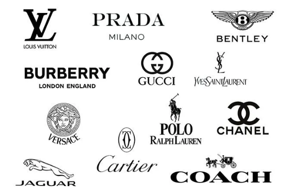
- Luxury brands: High-end brands like Chanel and Gucci often use black in their branding. Black signifies sophistication, power, and exclusivity, aligning perfectly with the luxury market.
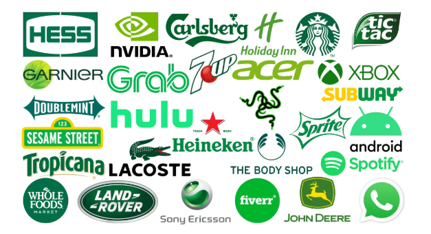
- Eco-friendly products: Green is the go-to color for brands promoting sustainability and nature, such as Whole Foods and The Body Shop. It represents growth, health, and harmony, reinforcing eco-friendly values.

- Healthcare: White and blue dominate in healthcare settings and branding. White represents cleanliness and purity, while blue creates a sense of calm and trust, which is essential for building confidence in medical services.
Understanding Cultural Differences in Color Perception
Colors can mean different things in different cultures, and understanding these differences is key when designing for a global audience. While colors may trigger similar emotions in some places, they can carry entirely different meanings in other parts of the world.
Here's why it’s essential to understand cultural differences in color perception and how it affects design.
How colors are seen around the world
- Red:
In Western cultures, red is often linked to love, passion, or urgency.

But in China, it’s a color of luck and celebration, especially during events like the Lunar New Year.
- White
White is the color of purity and weddings in the West,

but in countries like Japan and India, it’s connected to funerals and mourning.

- Black
In many Western cultures, black is linked to sophistication but also the color of mourning. Meanwhile, in some African cultures, black symbolizes maturity and wisdom.

- Green

Green often represents nature, growth, and life, but it can have different meanings in some cultures. For instance, in some Asian countries, it is associated with infidelity. In some South American cultures, it is associated with eternal repose.
Tips for designing with cultural sensitivity
When designing for an international audience, here are some helpful tips to avoid cultural misunderstandings:
- Do your research: Ensure you understand how colors are perceived in the cultures you're designing for.
- Avoid assumptions: Colors have different meanings, so don't assume they mean the same everywhere.
- Get feedback: If unsure, test your design with people from the target culture to see how they react.
- Go for neutral: If you're unsure what a color means, neutral colors like blue or gray are safe choices for a broad audience.
The Role of Color in Branding and Business Design
Color is a powerful tool in branding, shaping how your business is seen and remembered. Just as Tissot carefully selects colors for its watches to convey elegance, precision, and luxury, the colors you choose for your brand can communicate much about your brand identity, personality, and what you want customers to feel when interacting with your brand.
When used consistently, color makes your brand stand out and helps customers instantly recognize it.
Here’s how color benefits your brand:
How color shapes brand identity and recognition
Using the same colors across your logo, website, and marketing materials builds your brand's identity. Take a moment to think about popular brands, and you'll realize their colors are often the first thing you notice.
Over time, these color choices become as crucial as the brand itself, helping customers recognize and feel connected to what your business represents.
Famous logos
Some of the world’s biggest brands are instantly recognizable because of their unique color choices:

Amazon
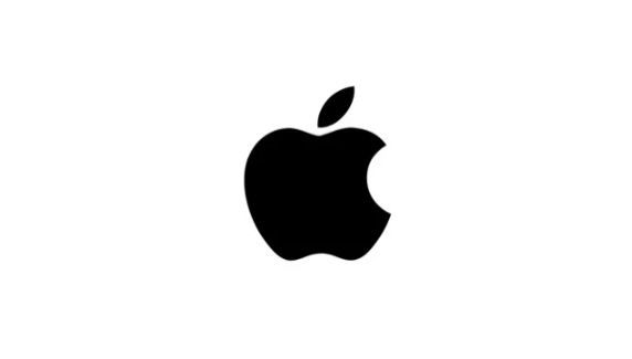
Apple
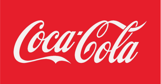
Coca-Cola

Google

McDonald’s
Nike
Pepsi
Starbucks
Target
Toyota
Designing for a Global Audience: Best Practices
When designing for a global audience, it’s essential to consider how different cultures might view your design. What works in one country might not be received the same way in another.
To make sure your design appeals to everyone, here are some simple tips to keep in mind:
- Be aware of color meanings: Colors can mean different things in different cultures. For example, white can represent purity in some places but sadness in others. Make sure your color choices work for all your audience.
- Use simple and clear images: Stick to symbols or images that are easy to understand and avoid ones that might have specific meanings in certain cultures.
- Keep text simple: If your design includes text, make sure it’s easy to translate and doesn’t rely on slang or phrases that might not make sense in other languages.
- Check local trends: Every region has its design preferences. Research local styles to ensure your design resonates with people from different countries.
- Test your designs: Before launching, get feedback from people in different regions to ensure your design works well everywhere.
- Pick readable fonts: Some may look bad in other languages or devices. Choose clean, readable fonts that work well across all languages.
Conclusion
Colors influence how people feel about a brand. When designing for a global audience, it’s essential to consider how colors and designs are seen in different cultures.
Want to create the perfect logo for your brand? Visit BrandCrowd! It’s quick and easy, and it helps you design a logo with the right colors and style to appeal to your global audience.
Read More on Designs Here:
Written by DesignCrowd on Monday, February 10, 2025
DesignCrowd is an online marketplace providing logo, website, print and graphic design services by providing access to freelance graphic designers and design studios around the world.
