Having a creative career usually involves a lot of portfolio submissions, rejections, and more submissions. One of the reasons for this is, designers, fall short when it comes to representing themselves. A portfolio website is mandatory if you want success in the creative side of the world.
Building a portfolio website is easier said than done. It is recommended to not stuff the website with all your projects. So the challenge is to pick the best ones. Next comes the design of the website itself. You want the design to represent yourself and your style. But you also should bring in variety to show the extent of your ability.
How do you strike the right balance?
Don’t worry, here are 15 charming design portfolios to take inspiration from.
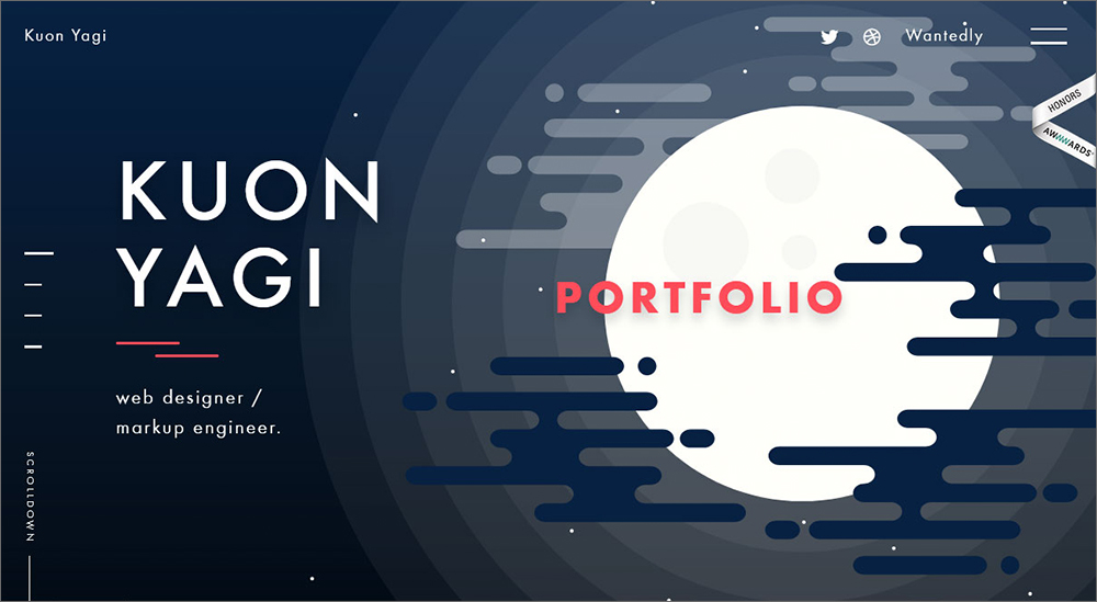
Tokyo-based designer, Kuon Yagi’s portfolio is the definition of responsive. He has a very fluid design concept that engages with the audience with even the slightest drag of the mouse. The color scheme is very contrasting, meant to catch the viewers’ eyes.
One of the best parts of this portfolio is the subtleness of the animations. It adds to the experience without being a distraction.
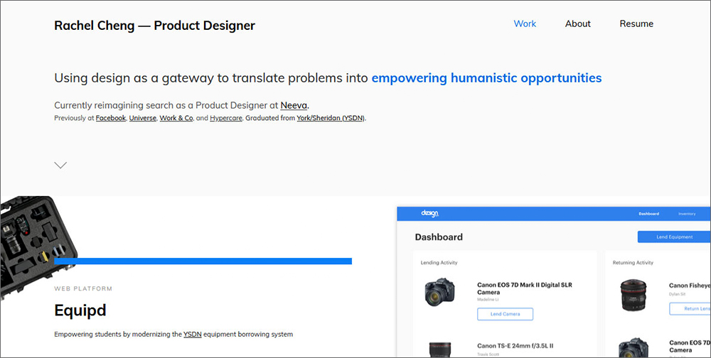
Neat and minimal would be the perfect way to describe Rachel’s portfolio. She uses straight lines and very few splashes of color to highlight elements. Besides these pops of color, the website remains monotone. This tells the audience exactly where to look.
There are no moving elements in this portfolio, which gives the audience no chance to miss her call-to-actions. This is the perfect way to showcase products, which is what she does.
Rachel’s about page features a very short time-lapse video that is meant to describe herself. This element hooks the audience to want to know more, which is what your portfolio should do as well!
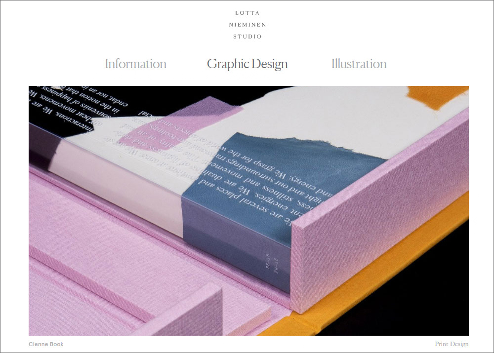
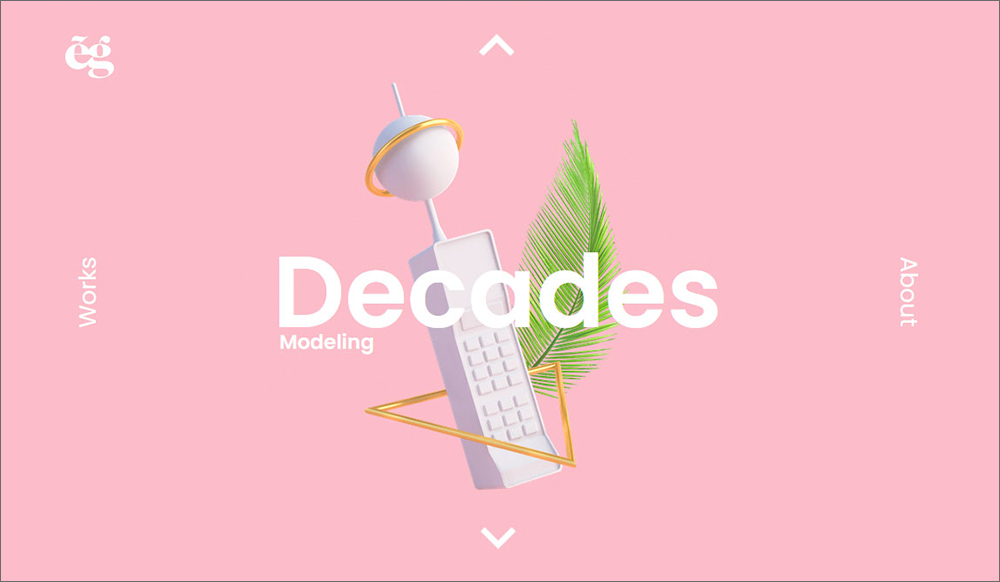
A website that scrolls both horizontally and vertically? That’s intriguing. Lotta Nieminen’s portfolio is reflective of her illustrations - whimsical and modern. This beautiful portfolio features her creative illustrations and minimal graphic designs.
It is a very clean website with a responsive design. The next page flows into the current page, making for a cool user experience. The elements are fixed which helps create calm and elegant navigation.
Julie’s portfolio plays with the effect of parallax scrolling. This makes the website extremely interactive and fun to look at. It’s built with very neat edges and a minimal design and oozes modernism.
This online portfolio is a perfect inspiration if you want to showcase all your best work without making the website messy. Simple and clean, Julie plays with color, making unusual color combinations work well together.
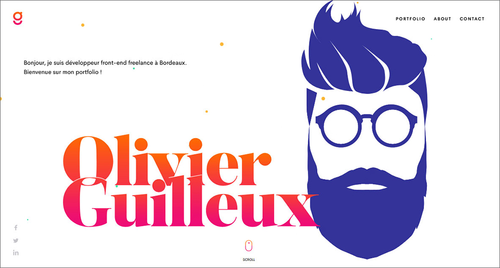
Can you effectively reach your audience without stuffing your portfolio with information and elements? You can if you follow Olivier’s example. Olivier is a WordPress website designer who has a very clean and minimal portfolio website.
He brings in pops of color with the vibrant gradient on his logo. Besides that, everything else is very monotone. His portfolio page is designed very prudently, making sure no colorful elements clash with each other.
Daniel’s portfolio is one of the few that pulls off bright colors without being distasteful. Once you click on a portfolio page, Daniel’s design completely changes. From the bright colors, we go to a very minimal and monotone-looking page. This brings in the effect of seriousness, which the details-page calls for.
His products’ library page shows images of smaller projects he has worked on. This page has been designed with very clean edges. This pattern makes sense with the multiple ideas that are showcased on that page.
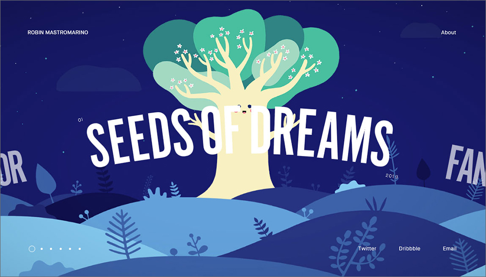
A design portfolio website with no empty space is what best describe’s Robin’s portfolio. This website scrolls sideways and is chock-full of animations that interact with the audience. The key factor is that the animation has been designed such that it doesn’t mess with the viewers but rather intrigues them.
Once you click on a project, you are led to a page with yet more animations and photographs that describe the work in detail. This page is designed in a very cool and creative way. Once you’ve scrolled all the way to the bottom, you land up at the front page again to explore more projects.
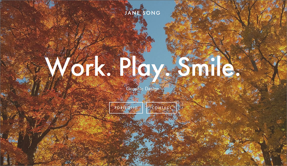
This graphic design portfolio gives you the same feelings as a peaceful walk during the peak beauty of seasons. Her main portfolio page is a gallery of the projects she has worked on. The front page has two call-to-actions and is otherwise just a slideshow of a couple of images.
She uses no flashy animations or big design elements. Instead, her website is very minimal and follows a very monotone color scheme. This helps give the impression that Jane is serious about her work and gets the job done.
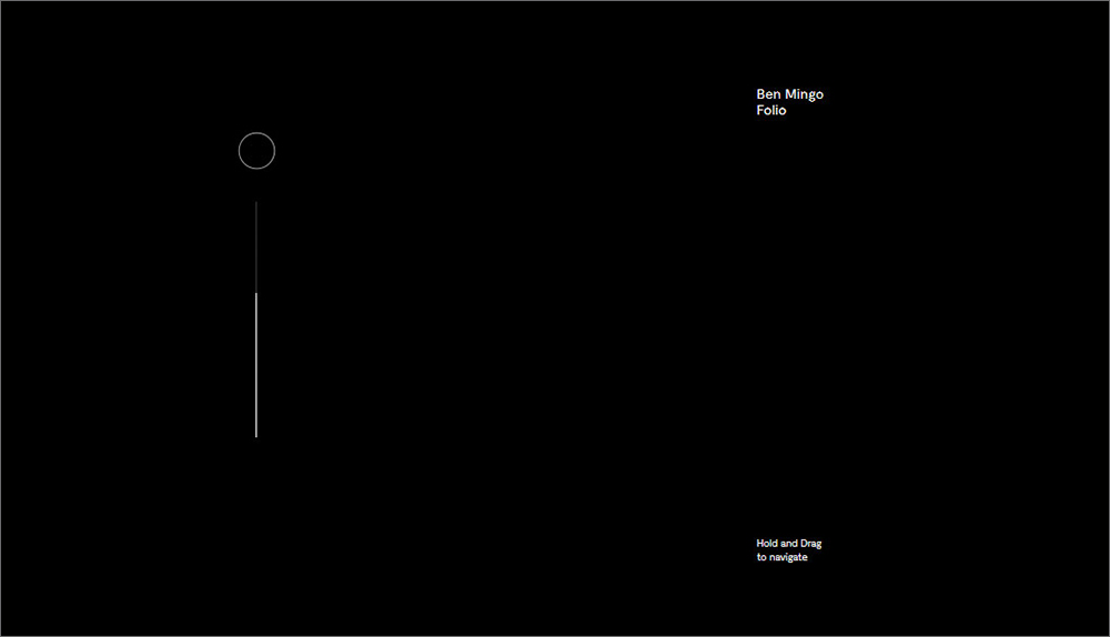
Ben Mingo’s portfolio oozes modern minimalism. It is the best portfolio example for a clean design that uses animation very smartly.
Navigation through the page is in itself very creative and unique, introducing the first element of interaction with the audience. The individual photo elements are animated to move along with the mouse, helping keep the viewers’ attention.
The project pages also follow the same minimal design with clean edges.
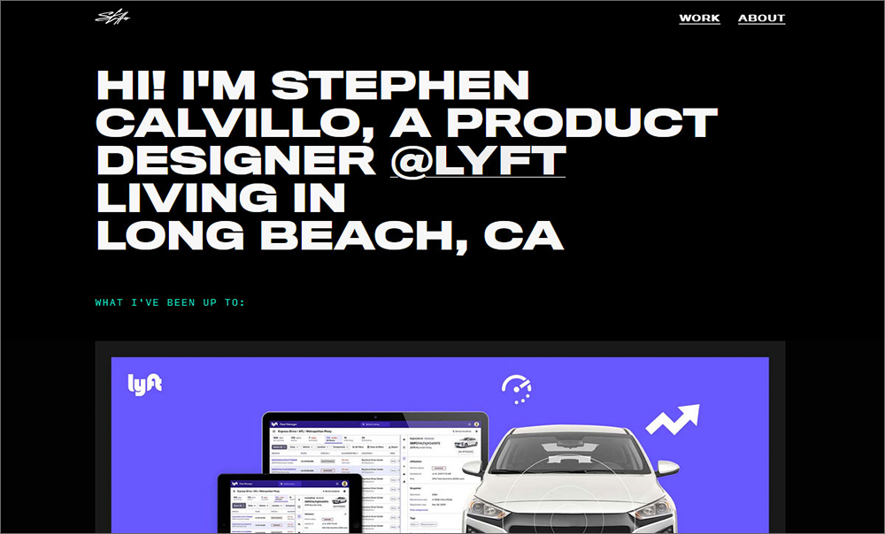
This design portfolio is very simple, but still accomplishes the task of getting the audiences’ attention. Stephen’s website features a dark theme with a minimal design that portrays all his designs.
A very simple animation element is introduced when you over images on the front page. This acts as an interactive element, without being distracting.
Once you click on a project, the theme shifts to a lighter one. This allows him to highlight his work without the background taking charge of the page.

This is the portfolio of a front-end developer that likes to keep things minimal. Martijn has a very flat design that’s pleasing to the eye. He has used a pastel color theme that helps the audience focus on the most important thing - the content.
The picture elements on the front page are off-center, which helps bring variety to the website design. The project pages are more colorful and represent the designer’s work in a minimal, but detailed, way.
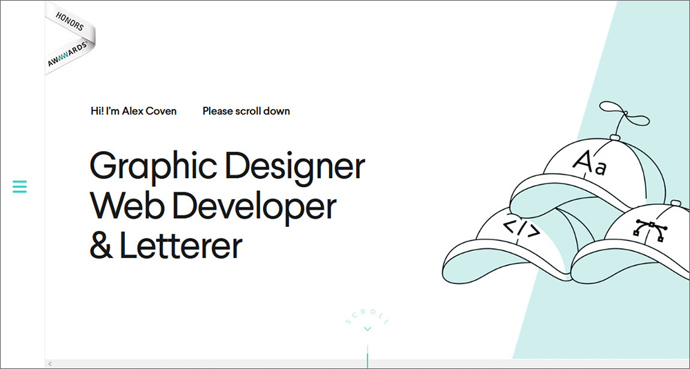
Alex Coven’s portfolio website is a myriad of colors on a light base. Alex’s website is one of the few that uses a hamburger menu for navigation. The website has smooth navigation with a very low loading time, making for a good user experience.
The front-page features full-screen images to highlight his work. There is a touch of simplicity and minimalism throughout the website despite the vibrant colors used. This shows how good the designer is at playing with colors.
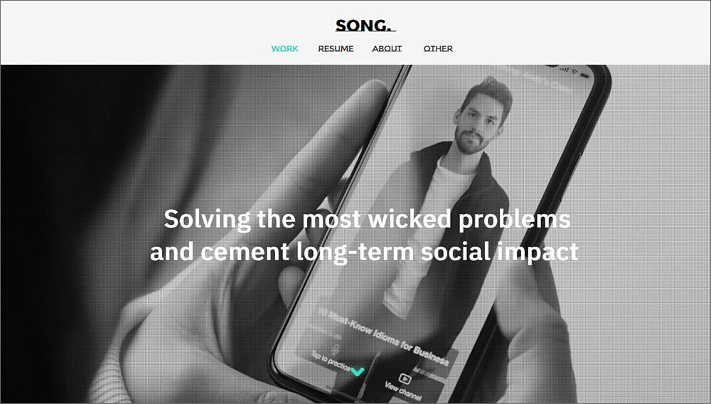
Karen Song’s portfolio website gives off the vibe of being work-focused. She has a dark-themed front page where her individual projects are mentioned. This is done in a gallery format that very closely resembles a news or blog website.
Once you click on a project, the theme becomes lighter. She doesn’t have many animations or flashy design elements, letting the viewers focus only on the content. If you want to get to the point without beating around the bushes, Karen’s is the best portfolio website to take lead from.
Bright pops of color and interactive cursor movements are one of the highlights of Etienne’s portfolio website. He brings in what he’s best at, 3D and motion, to the website.
The fullscreen pages allow viewers to focus only on one project at a time. Scrolling through the projects is a whole new experience in itself. He uses a parallax scrolling effect that adds to the user experience.
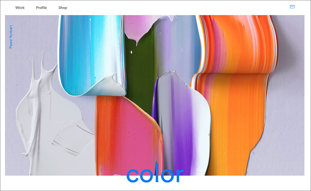
One scroll through the website and you’ll know that playing with colors is Pawel’s cup of tea. He excels in making vibrant colors work together without being harsh on the eye.
The portfolio is designed in a gallery format with not many animations. But due to the presence of so many colors, viewers won’t miss the animation. The project pages are yet more splashes of color, but this time, on a light-themed background.
Final Thoughts
Designing your portfolio may be a daunting task. But with these inspirations on hand, you can make the job easier for yourself. If you want the color to be the main focus of your portfolio, we recommend you look at Pawel Nolbert’s or Daniel Polevoy’s. If you want animations to be the main attraction, Robin Mastromarino’s or Kuon Yagi’s are the ones to pick as inspiration.
Read more about portfolios and freelancers:
Written by DesignCrowd on Friday, August 13, 2021
DesignCrowd is an online marketplace providing logo, website, print and graphic design services by providing access to freelance graphic designers and design studios around the world.
