Updated September 12, 2025
What’s in a name? Well… sometimes, just three letters can say it all.
Think of IBM, HBO, or CNN: short, snappy, and instantly recognizable. These three-letter powerhouses prove that a well-crafted letter logo can pack a serious punch. Whether you're launching a new brand or just geeking out over iconic logo design, this list is here to spark some serious creativity.
In this roundup, we’re diving into 30 famous three-letter logos that have stood the test of time (and marketing trends). Ready to get inspired? Let’s jump into the world of logos, where three letters make a lasting impression.
Famous Three-Letter Logos
You’ve likely seen these text logos at least once in your life. We’ve included designs in this list that will help you better understand what to do and not to do when designing a calligraphy logo.
CAT

This manufacturing company's logo is a construction logo seen in households and project sites. It makes the typical text interesting by adding a bright yellow triangle in the middle of the design. Caterpillar has been using this version since 1989.
KFC

Food companies use the color red in their symbols for good reason. The color is known to get the appetite going. The fast-food chain incorporates effective color psychology to decorate its lettermark logo.
Just in case you were wondering, the Kentucky Fried Chicken text is written in a serif font called Daily News Extra Bold Italic. It gives the design an eye-catching and dominant appeal.
NBA

This iconic silhouette logo of the National Basketball Association was designed by Alan Siegel. The man featured in this three-letter classic is Jerry West. The design is used widely in ads, tournaments, and video games.
MTV

MTV is one of the fortunate brands that started off with a great logo. It has become an essential part of popular culture, to say the least.
Since its debut in 1981, the symbol has undergone minor redesigns. Looking at the MTV logo evolution, you will see how the lines and strokes have become more balanced over the years. The bold letter M is still fashionably overlapped with “TV.”
AT&T

Some say it looks like the Death Star, while others think of the design as the globe. The telecommunications company couples its slim font choice with a striped blue figure. The stripes surely help draw eyes to itself.
It was in 2015 when the brand decided to redesign its logo with a flat art style.
RCA

The Radio Corporation of America has existed since 1919. The brand logo has undergone many changes. Its original version was a wordmark complete with an illustration of Earth.
Today, the logo is more straightforward and concise. Changing a company logo into initials is a smart choice for businesses that have been well-recognized through the years.
YSL

Yves Saint Laurent is a fashion powerhouse that originated in France. This style of overlapping initials is called a monogram. Each letter transitions into the other well, making a minimalist statement.
This luxury logo's black and white color allows it to be highly adaptive to any application.
IBM

Created by Paul Rand, a renowned corporate designer, IBM rebranded itself into a more modern tech company. This stunning blue logo is comprised of 8 bars that build the lettermark’s silhouette.
HBO
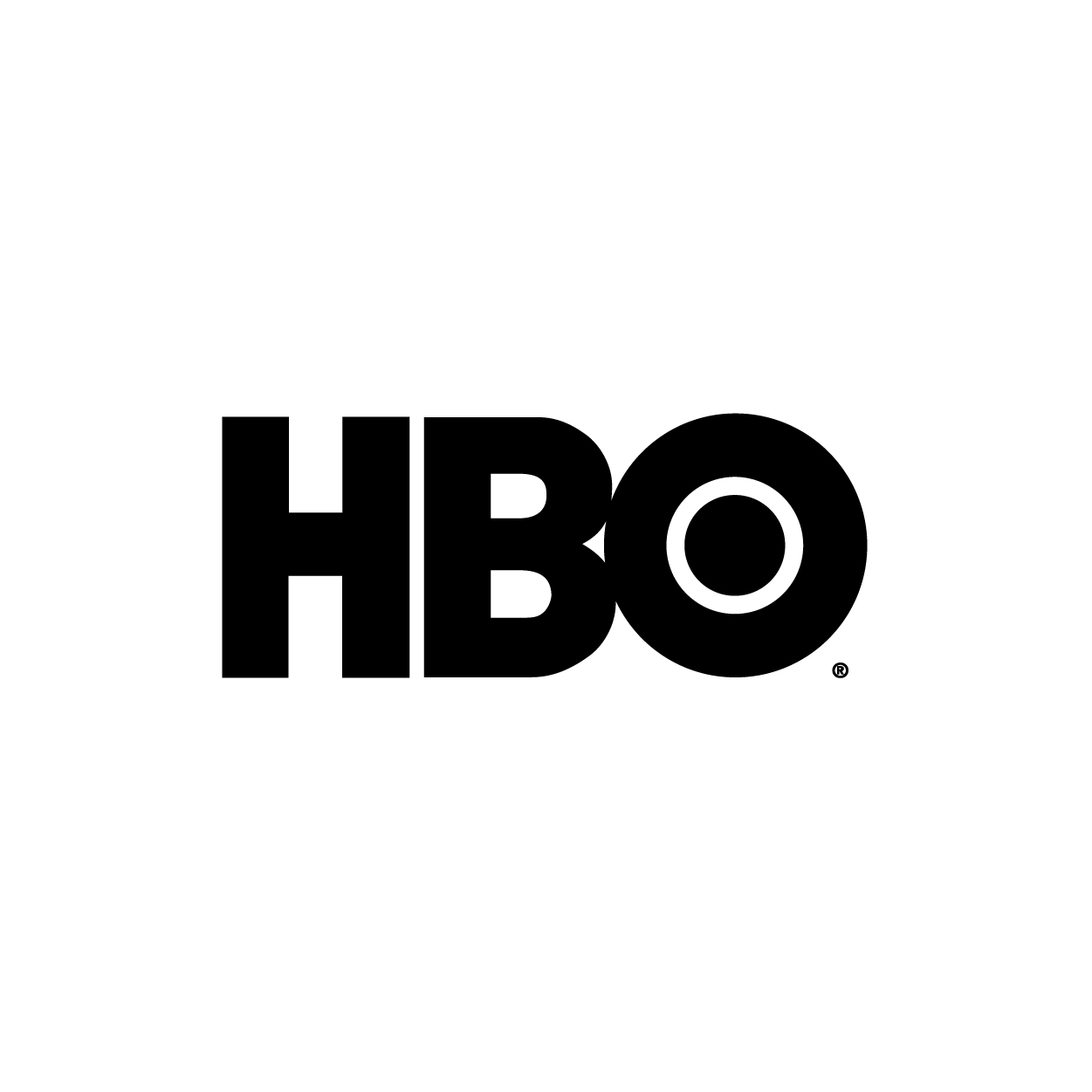
The Home Box Office channel has a simple yet impactful logo. It doesn’t have a complicated design which makes it more versatile when put on other platforms and marketing materials.
This logo features a sans-serif font called Avant Garde Gothic. The letters “B” and “O” add an eye-catching effect.
BBC

The BBC logo is a minimalist powerhouse: three bold black squares containing a white capital letter. Its simplicity reinforces the brand’s authority and trustworthiness in global media. The consistent sans-serif typeface has remained unchanged, lending it a timeless, no-frills appeal. It’s instantly recognizable, even when shrunk to a thumbnail, proving that less can be more.
UFC
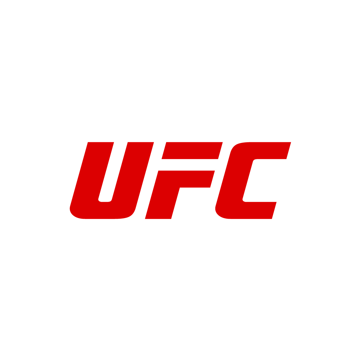
The UFC logo is aggressive and assertive, much like the sport it represents. The sharp, italicized lettering gives a sense of motion and impact, ideal for a brand rooted in combat. It's blocky, and the all-caps style conveys strength and dominance. When you see those three letters, you know something intense will happen.
CNN
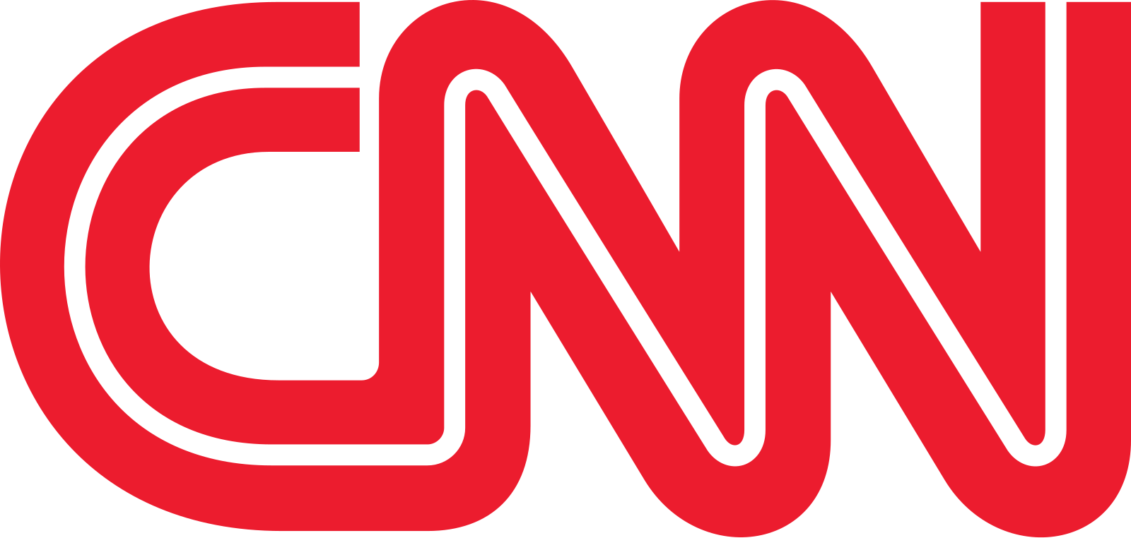
CNN's logo is sleek, continuous, and iconic. The red monoline typeface connects all three letters in one flowing stroke, symbolizing nonstop news coverage. The bold, modern design has endured for decades, requiring no embellishment to be instantly recognizable. It’s one of the most memorable logos in media: clean, confident, and built for screens.
GAP
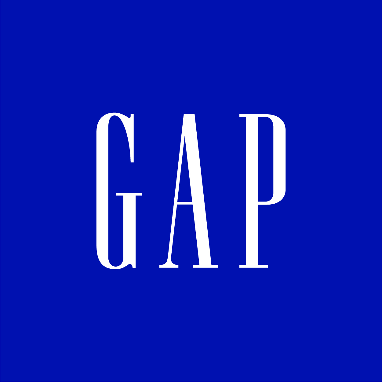
The GAP logo is defined by its simple, all-caps serif typeface: classic, clean, and timeless. Set traditionally in navy blue, it evokes a sense of trust and American heritage. The old square "box" version became iconic, representing structure and consistency. It’s understated, but that’s exactly what gives it its staying power.
NFL
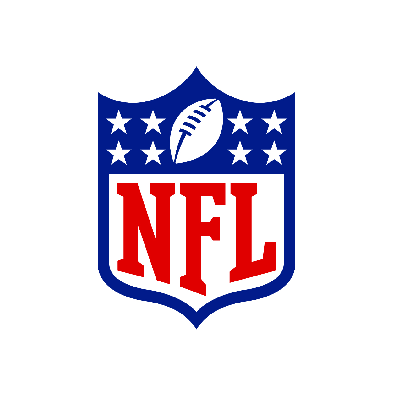
The NFL logo combines patriotism and power with a traditional shield design. The red, white, and blue palette and stars give it an official, almost governmental feel, perfect for America's most popular sport. A football sits prominently above the bold “NFL” letters, anchoring the brand visually. It's designed to look like it belongs on both jerseys and championship trophies.
UPS
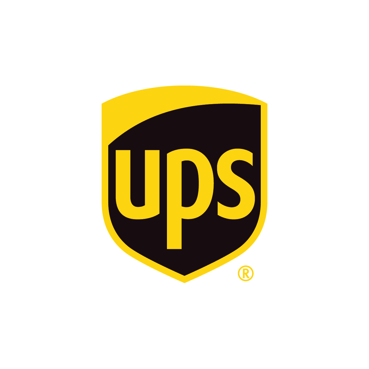
UPS's logo is a study in warmth and reliability. Its brown and gold color scheme is unconventional in branding, but instantly identifiable. The shield shape conveys security and protection, reinforcing the company’s promise of safe delivery. The bold “UPS” lettering is clean and strong, giving it a no-nonsense look that works across packages, planes, and storefronts.
DHL
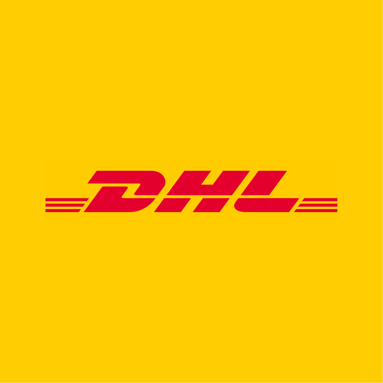
DHL’s logo is all speed and energy. The bold red letters, slightly italicized, stretch across a bright yellow background, colors chosen to grab attention and suggest urgency. Horizontal stripes reinforce the idea of motion and global reach. It’s hard to miss and forget, just like the company’s fast-paced operations.
HTC

HTC’s logo embraces a minimalist, lowercase design with a clean, futuristic typeface. The slim letters and gentle curves speak to its high-tech identity. Its green hue adds a touch of vibrancy and freshness, setting it apart in the tech space. The simplicity makes it versatile and quietly sophisticated.
HCL
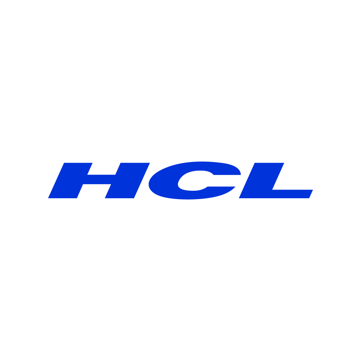
The HCL logo opts for a straightforward approach: blue, bold, and reliable. Its sans-serif font feels industrial and modern, perfect for a global IT services brand. The letters are evenly spaced and strong, projecting stability and competence. It’s the kind of logo that says, “We get the job done.”
SAP
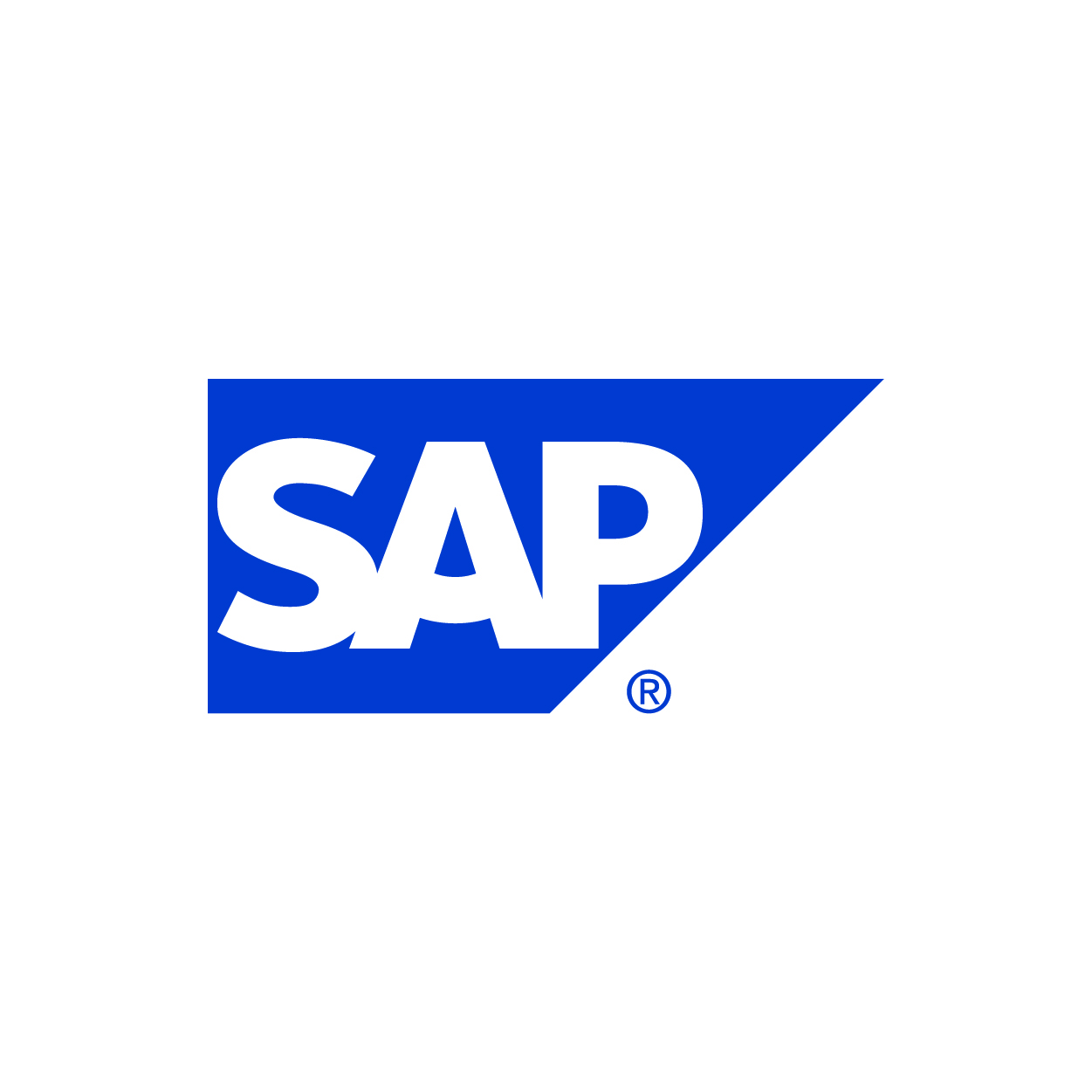
SAP’s logo is crisp and modern, featuring white letters inside a bold blue triangle. The slight italic slant adds motion, suggesting forward-thinking and innovation. The triangle gives it a dynamic, directional feel, pointing toward progress. It’s a clean, corporate look that speaks to precision and control.
PSP

The PSP logo is sleek and futuristic, perfectly fitting for a handheld gaming console. The spacing and geometric style of the letters feel digital and tech-forward. It’s simple yet stylish, like the device it represents. The thin, angular lines evoke portability and elegance in design.
Wii
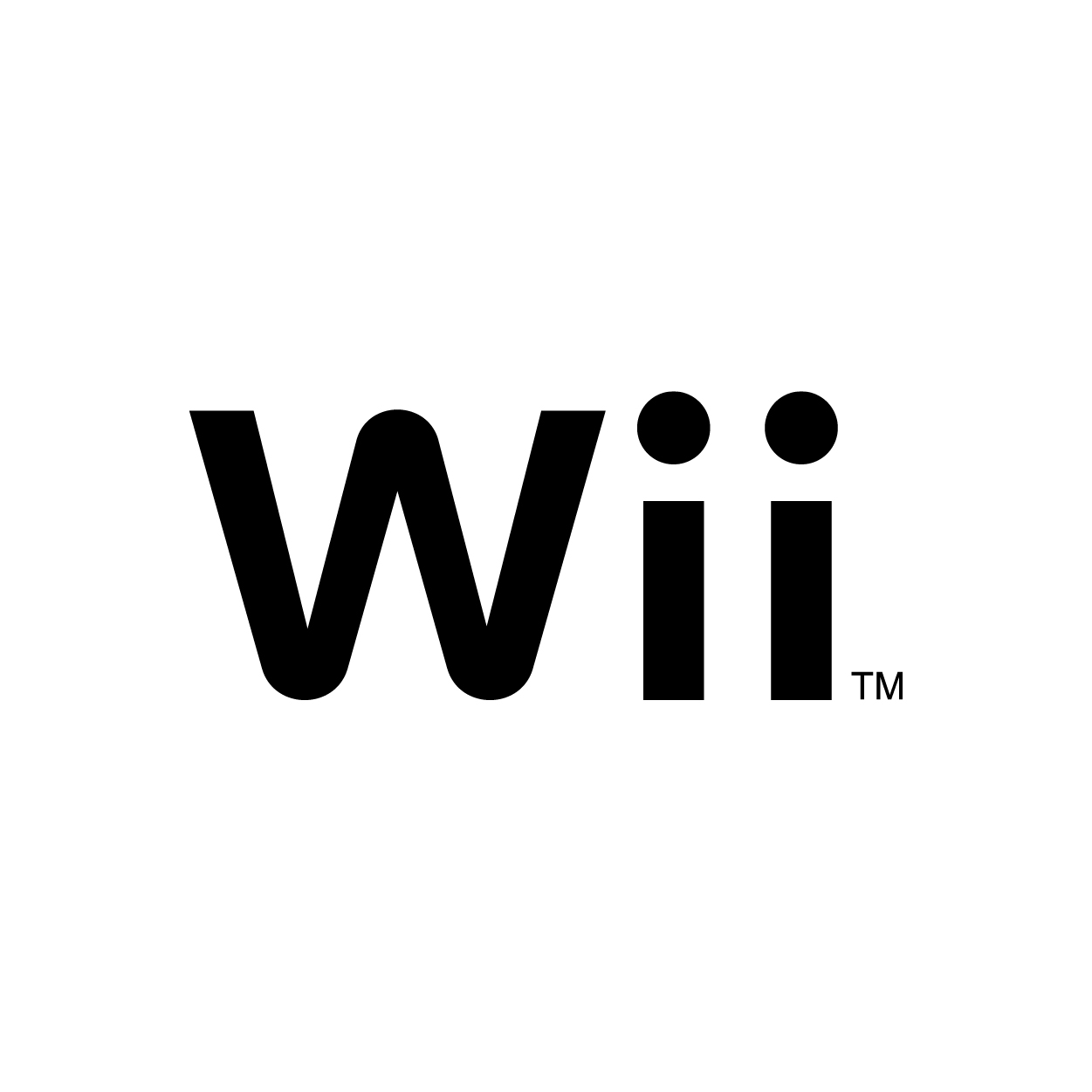
The Wii logo is playful and friendly, with soft, rounded letters in a calming gray. The lowercase design suggests approachability, making it feel inclusive and family-oriented. Its symmetry and simplicity make it easy to recognize even without color. It reflects the console’s mission to bring everyone into the game.
Lee
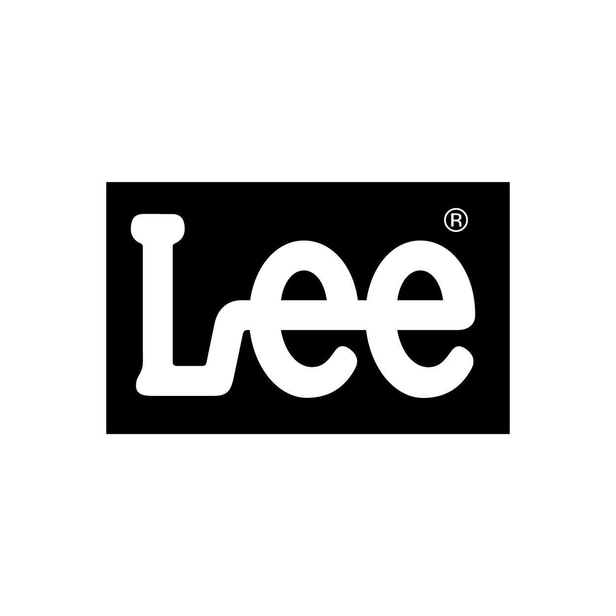
The Lee logo features hand-drawn, slightly irregular lettering that gives it a personal, lived-in feel, just like your favorite pair of jeans. The black-and-white color scheme is unpretentious and timeless. Its unique lowercase letter "e" and organic curves make it instantly identifiable. It’s casual, comfortable, and quietly cool.
ABC

ABC’s logo is a masterclass in simplicity: three lowercase white letters inside a perfect black circle. Designed by the legendary Paul Rand, it has barely changed since the 1960s, for good reason. Like a camera lens or TV screen, the circular shape feels complete and balanced. It’s clean, modern, and instantly iconic.
NME

Bold fonts can be the bread and butter of your logo. New Musical Express used Sharp Sans to create a clean redesign of its old logo in 2013.
This attention-grabbing logo aims to make the digital magazine a more authoritative and credible voice in the music industry. The brand symbol is often placed in the upper left corner of every issue.
KIA

KIA's latest logo is a bold departure from its past, with connected, stylized letters that resemble a futuristic symbol more than traditional text. The angular lines and minimalist design reflect the brand’s shift toward innovation and electric vehicles. It's visually striking and sparks curiosity. At first glance, it might even be mistaken for a symbol, precisely the point.
GMC
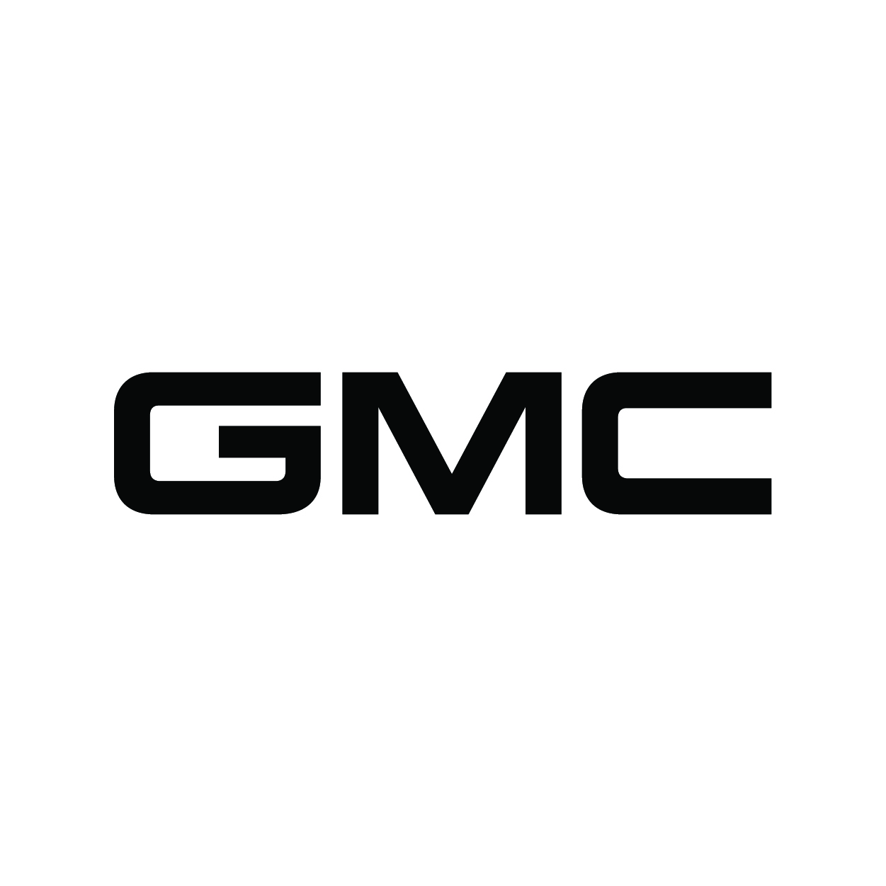
The GMC logo is strong and commanding, with bold red letters outlined in chrome. The block-style font gives it a heavy, grounded presence, perfect for trucks and SUVs. The use of metallic effects suggests toughness and industrial strength.
UBS
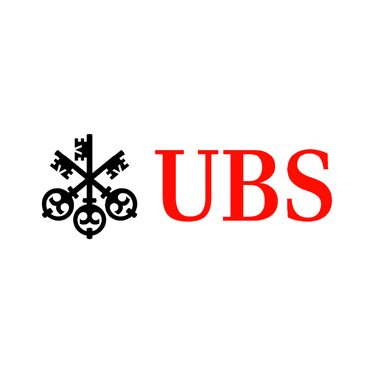
UBS’s logo combines sleek, serif typography with a unique trio of keys, a nod to security and wealth management. The keys are highly symbolic, representing confidence, security, and discretion. The use of red and black balances tradition with modern professionalism. It’s elegant, distinctive, and rich in meaning.
NBC

NBC’s logo is a colorful peacock with six vibrant feathers, each representing a different company division. The negative space between the feathers subtly forms the bird’s head, a clever and elegant design. It’s one of the most recognizable logos in television history, full of life and diversity. The peacock itself has become a symbol of entertainment and pride.
ING
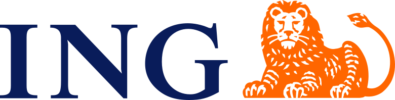
The ING logo features a bold blue wordmark and a proud orange lion, both elements tied to Dutch heritage and strength. The lion stands for courage and leadership, while the orange color grabs attention and adds energy. The clean font keeps it modern, while the symbol adds personality. It’s an outstanding balance of corporate and character.
JBL

JBL’s logo is compact and punchy, just like its speakers. The bold, uppercase letters are clean and balanced, often paired with a small exclamation mark or audio wave for added flair. Its bright orange color makes it stand out in a crowded tech market. Whether on a headphone or a massive speaker, it always feels modern and loud, visually and sonically.
Other Three-Letter Logo Ideas
Now that you've seen how iconic three-letter logos can be, check out our collection of customizable three-letter logos below:
Yellow Letter by BrandCrowd

Letter P Page by BrandCrowd
Innovative HVAC Services by Design.com
Orange Esports Letter Text by BrandCrowd
Football Sport Training by Design.com
Modern Company Letter T by BrandCrowd
Athletic Speed Dynamics by Design.com
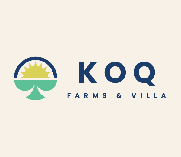
Farm Leaf Sprout by BrandCrowd
Romantic Beauty Boutique by Design.com

Mountain View App by BrandCrowd
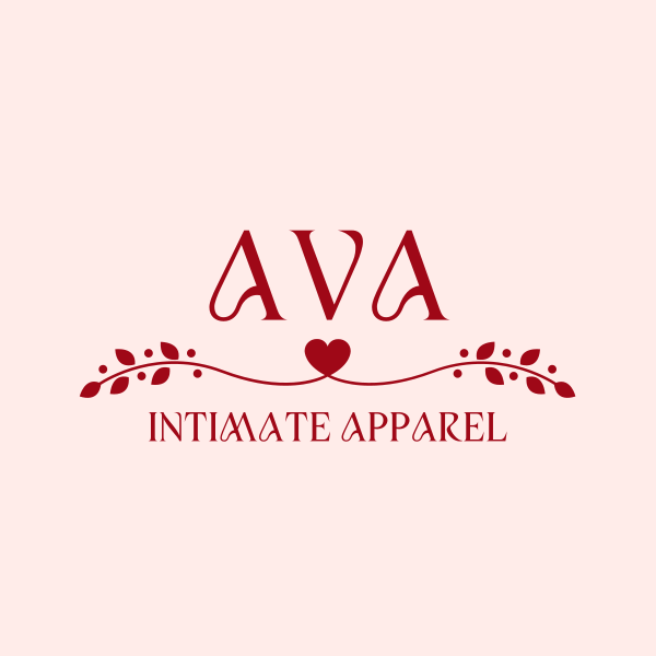
Romantic Heart Wedding by Design.com
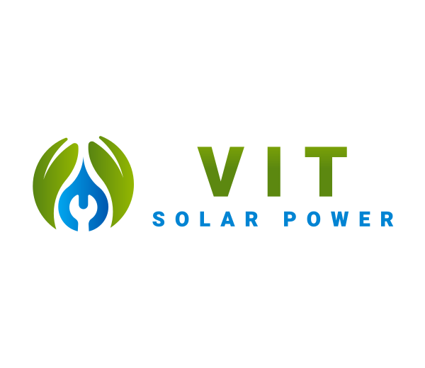
Eco-friendly Plumber by BrandCrowd
Geometric Business Studio by Design.com

Abstract Hand by BrandCrowd
Bold Minimalist Realty by Design.com 
Multicolor Orbit Ring by BrandCrowd
Benefits of Three-Letter Logos
Here’s why they work so well:
- Instant recognition: Short and sweet sticks in the mind. A letter logo is easy to recall, pronounce, and repeat, making your brand more memorable at first glance.
- Versatility across platforms: Whether it's a business card, social media icon, or billboard, three-letter logos scale beautifully. Their simplicity makes them adaptable to all kinds of formats and sizes.
- Strong visual impact: A bold, minimal design can pack a punch. With just three characters, designers can create powerful visual identities that feel clean, modern, and confident.
- Great for acronym-based named: If your brand name is long or includes multiple words (like “International Business Machines”), a three-letter acronym (like IBM) gives you a sleek and marketable shortcut.
Conclusion
Three-letter logos show that you don’t need a lot to make a big impact. They’re clean, easy to remember, and work well across all kinds of designs.
From famous brands to fresh ideas, these logos prove that a simple combo of letters can say a lot. Whether you’re starting a new business or rebranding, a three-letter logo might be just what you need to stand out.
Feeling inspired? Time to create a logo that’s short, sharp, and unforgettable. Visit BrandCrowd and get creative!
Read More on Logo Design Here:
Written by DesignCrowd on Friday, June 12, 2020
DesignCrowd is an online marketplace providing logo, website, print and graphic design services by providing access to freelance graphic designers and design studios around the world.
